
The waves were abstract. This one is a place.
Seven colourways of the same minimal cityscape — buildings, clouds, sky. Something that looks like somewhere without being anywhere specific.
How This One Came Together
After the Stacked Waves set, I wanted to try something with more structure in it. Waves are organic and fluid — they work because they feel like movement. But I was curious about something more geometric. Something with edges.
The cityscape shape came from thinking about what wallpapers I actually stop and look at on my own phone. The ones that hold my attention tend to have a horizon line and some sense of depth. A skyline gives you that without being complicated. Buildings in silhouette, a few clouds, a gradient sky. Simple enough to not fight with your app icons, interesting enough that you do not get tired of it.
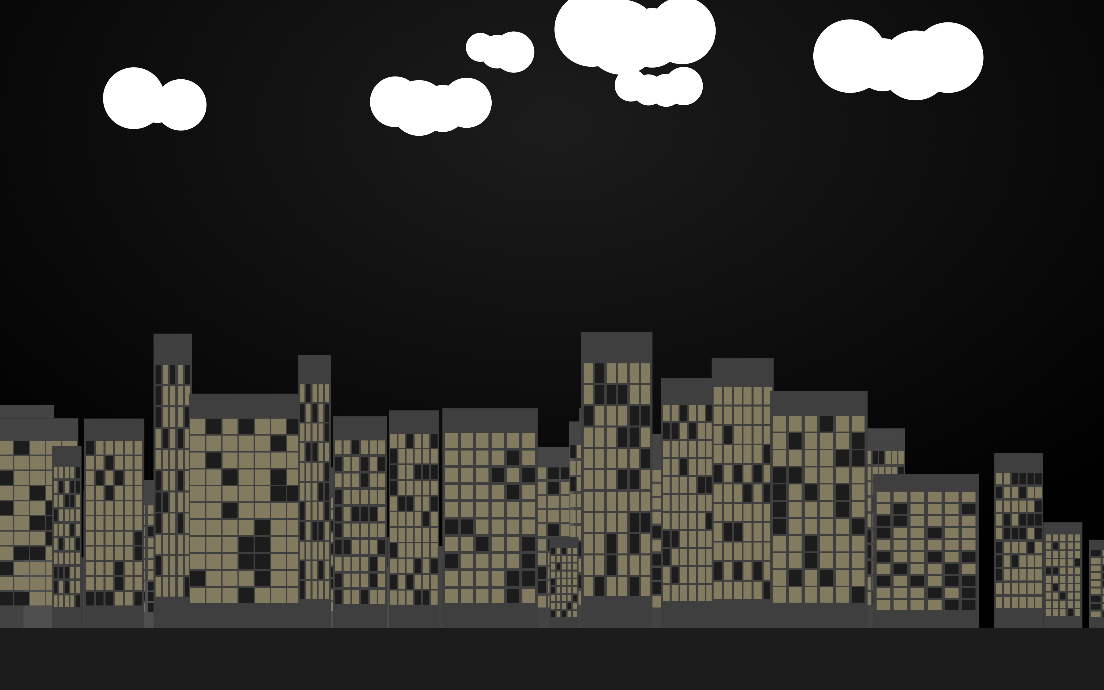
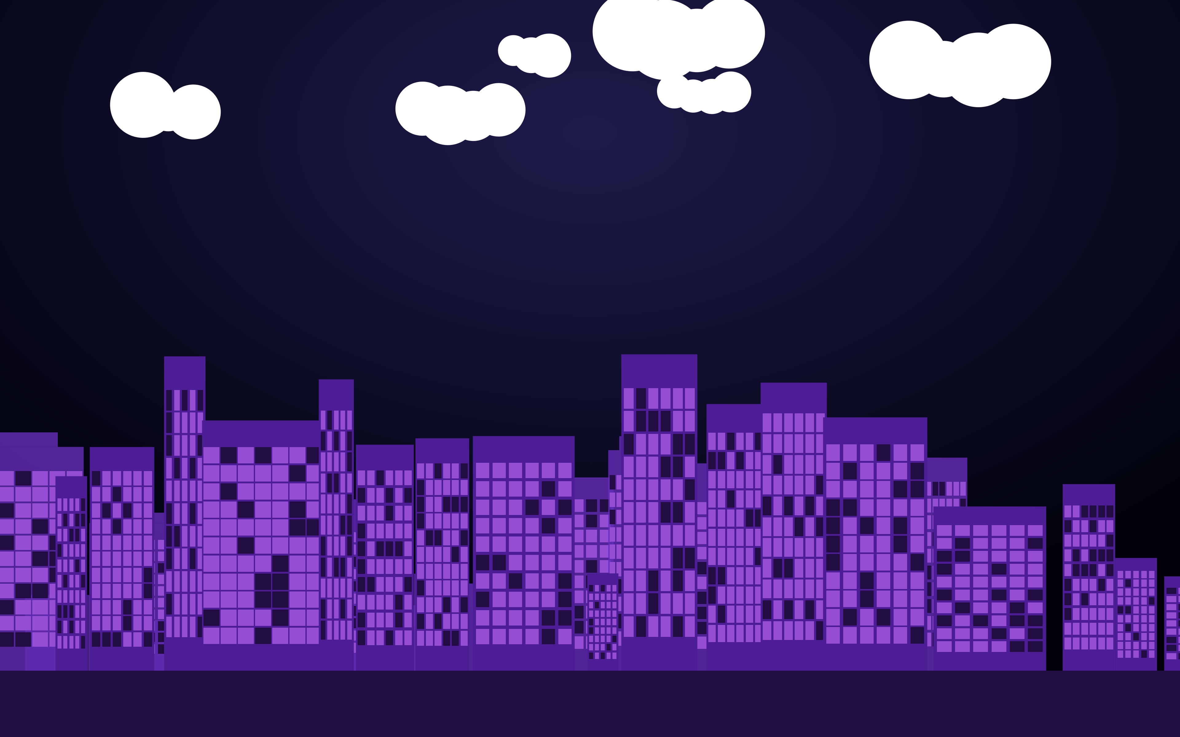
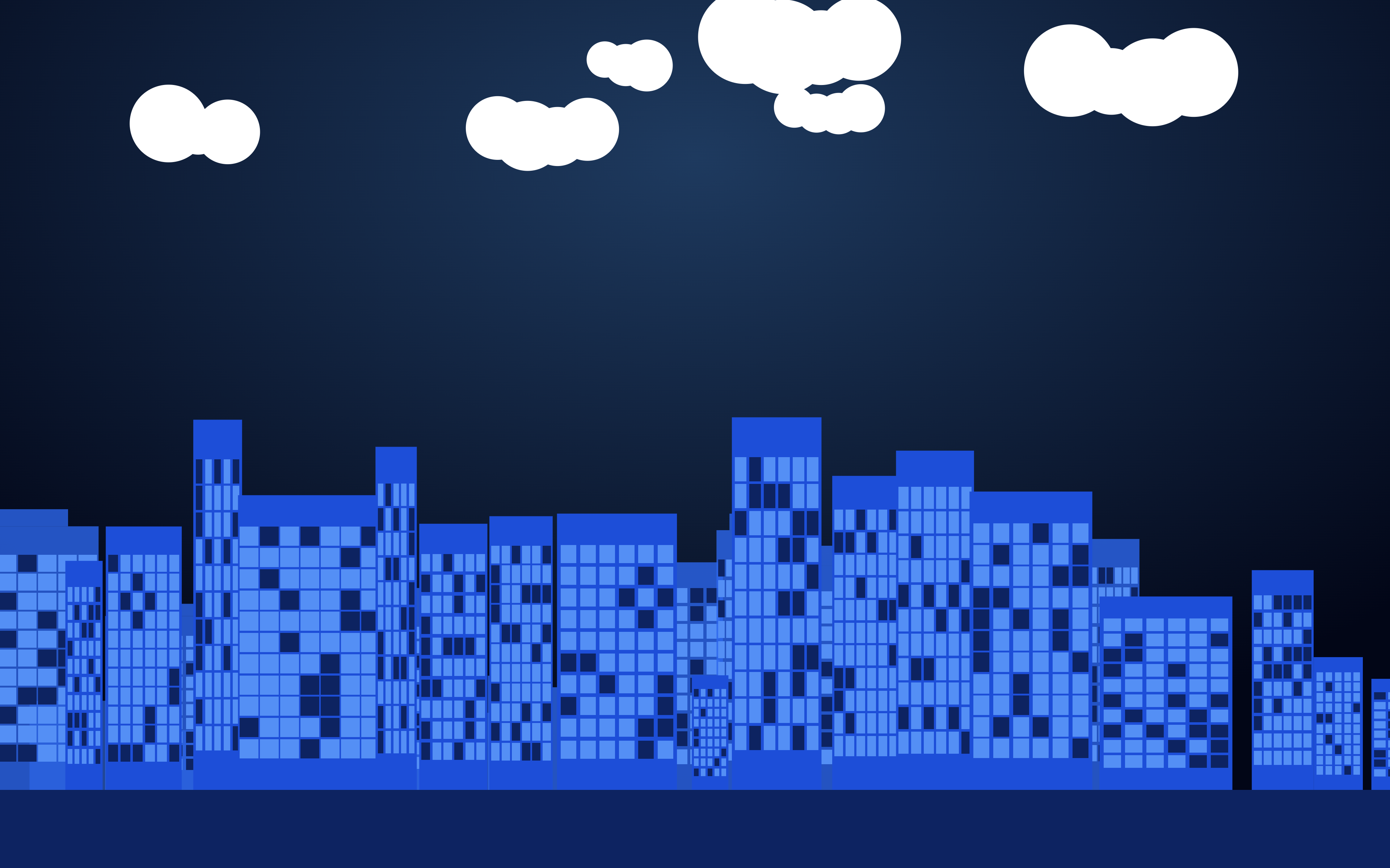
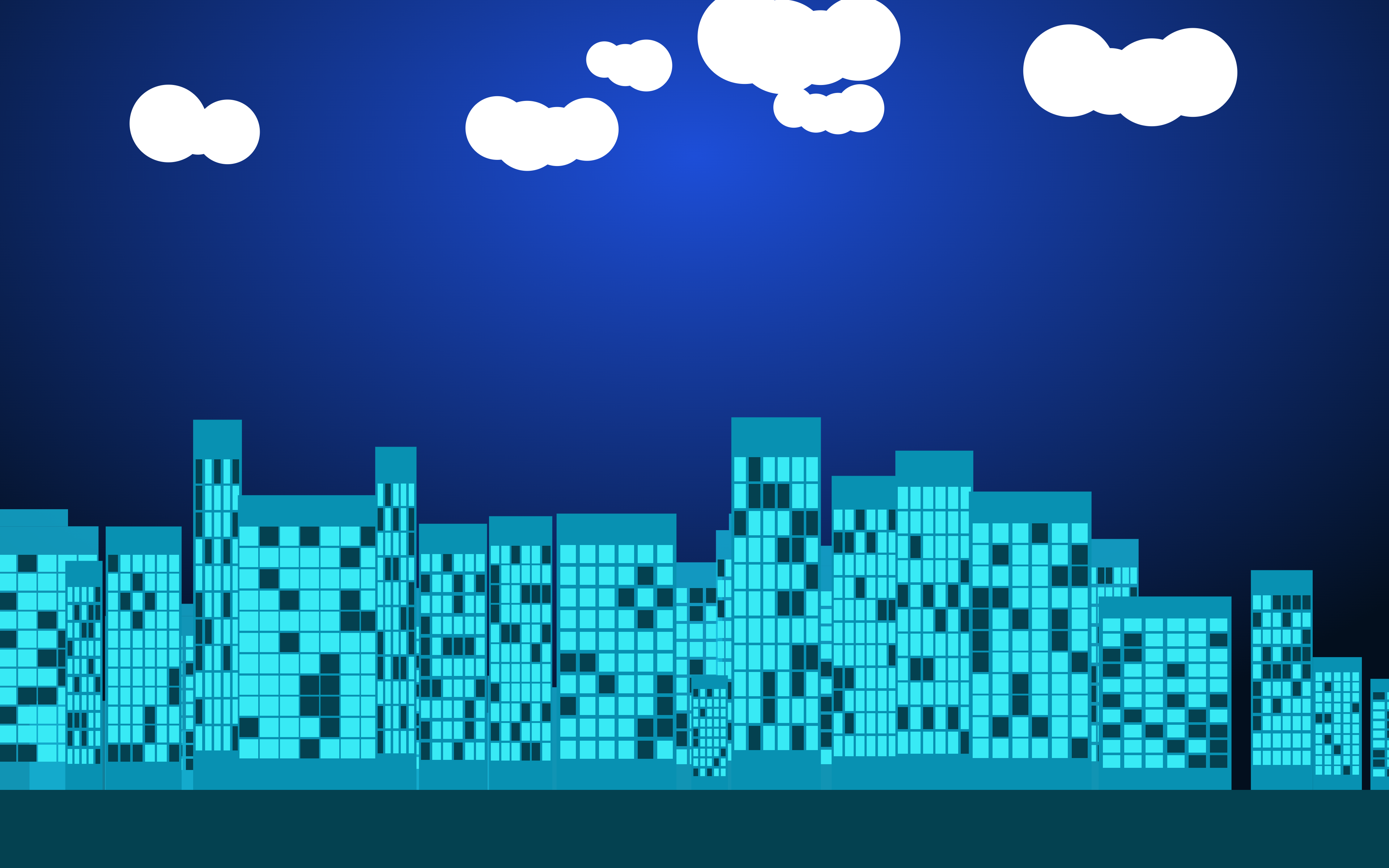
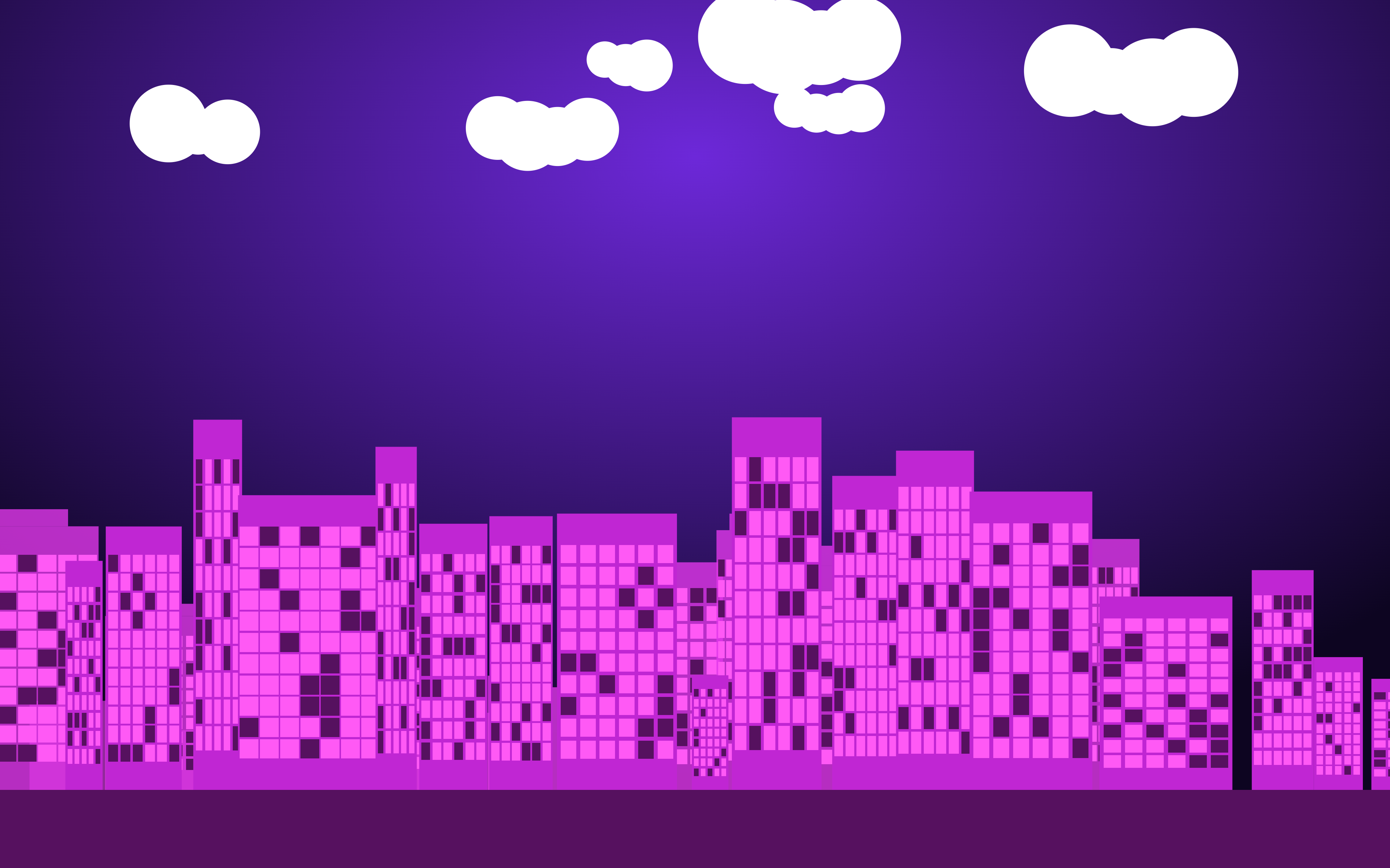
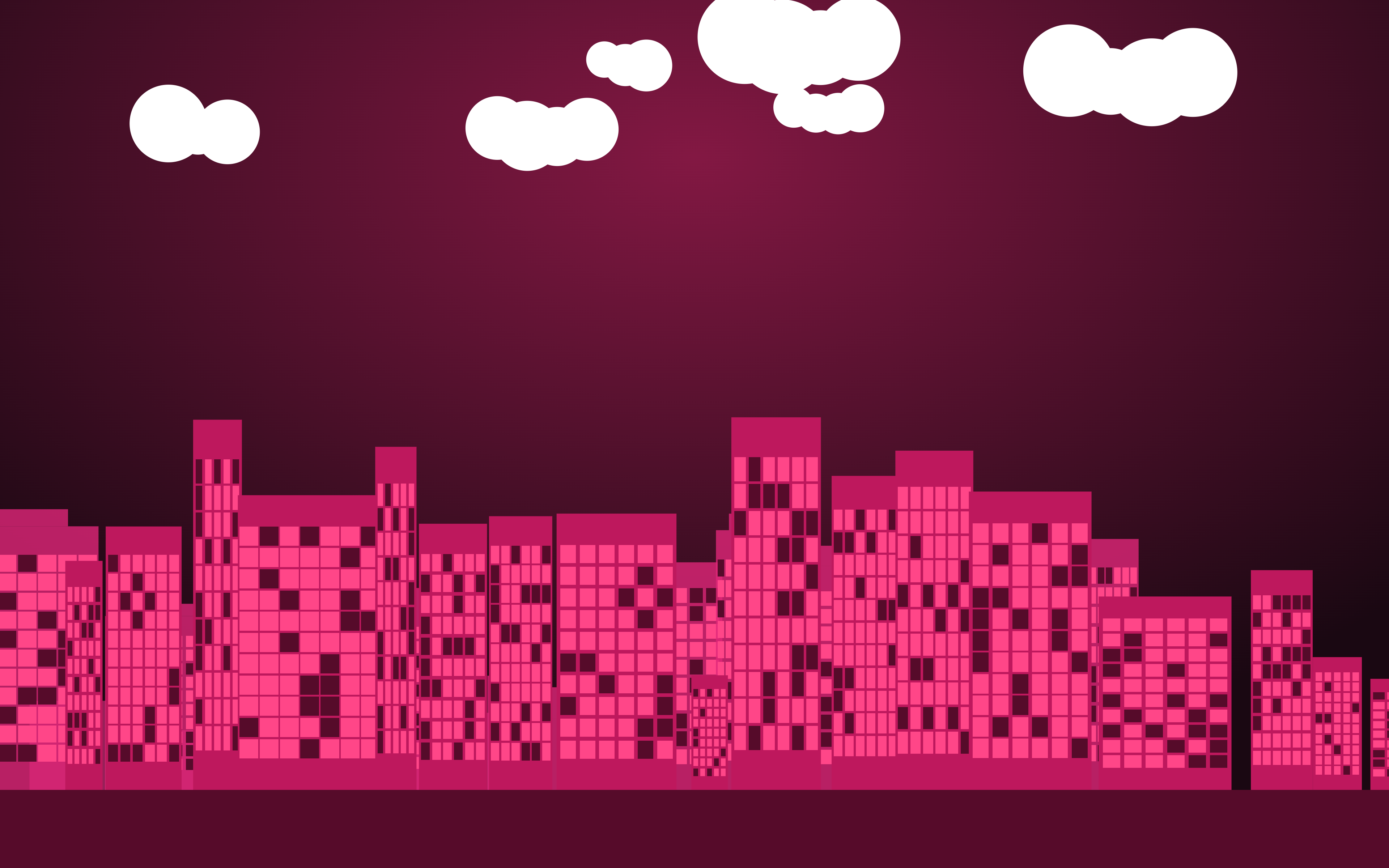
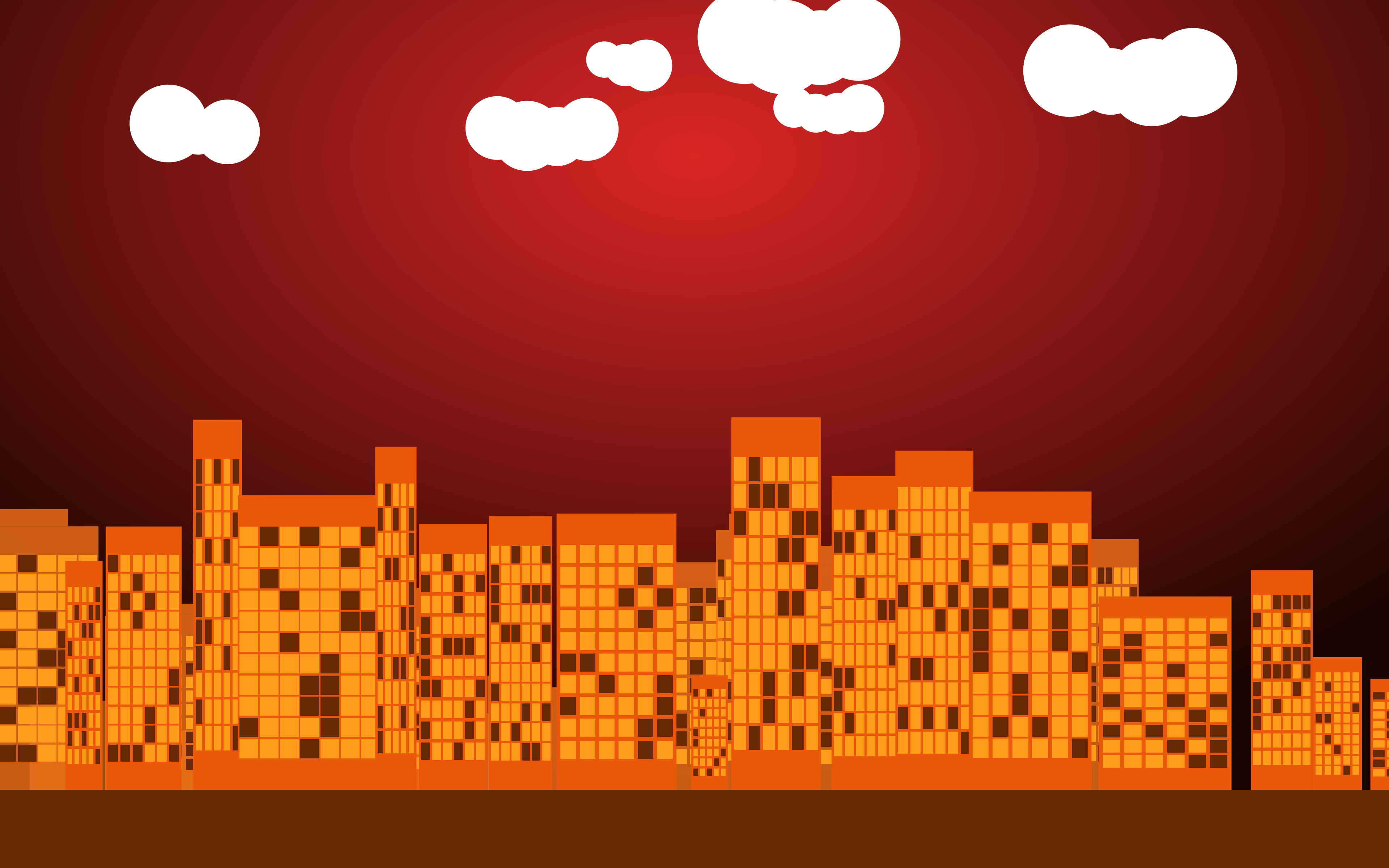
I built one version and then just kept going through the colour palette. Dark was first — it felt right for the site. Then Night, Blue, Teal, Purple, Pink, Red. Seven total. Each one is the same composition, just shifted into a different mood.
Which One to Pick
Dark and Night are the ones I keep coming back to personally. They sit well on a phone screen without drawing too much attention to themselves. The Red is the most dramatic — warm and slightly ominous, which I like. Teal is the cleanest of the bright ones. Purple has two versions that ended up quite different from each other: the bright Purple feels electric, the Night version is quieter and more considered.
All seven are below. Free to use, no credit needed.
Download
Long press on iPhone to save. Right-click on desktop to save as.
All wallpapers created by Sunny B. Free to use for personal use.
If something here was worth your time, you can buy me a coffee — it genuinely helps keep this going. And if you’d like new posts straight to your inbox, no spam, no schedule pressure, subscribe here.

Leave a comment